Summary
Joy of the Lord, print is an open-edition fine art print by Anne Reid Artist, based on the 2016 original painting Joy of the Lord and released as a print in 2026. Painted during a House of Prayer set at Catch the Fire Toronto, it carries a personal testimony in color: God entering grief and transition, pouring love into the heart, and forming a deep, sustaining joy. The original painting remains in the artist’s private collection.
Artwork Statement
I painted Joy of the Lord in 2016 during a season of significant transition. A meaningful chapter had closed and I was carrying grief, uncertainty, and distress. I did not set out to make a signature piece. I simply began to paint because I needed a way to respond when I did not have many words.
Over time, I have come to see this painting as a picture of the inner life of the believer — an abstract map of the heart and soul being met by the presence of God. The title comes from Nehemiah 8:10: “The joy of the Lord is your strength.” I was not trying to illustrate the verse literally. I wanted the painting to carry joy as something substantial and strengthening through light, warmth, lift, and inward steadiness rather than through surface cheerfulness alone.
This is not a denial of pain. It is a picture of God entering the pain, pouring His love into the heart, healing the broken places, and transforming the inner life.
Color & Mood
- The warm gold surrounding the central opening speaks of the glory of God — an atmosphere larger than the wound, larger than the moment, holding the whole composition in His presence.
- The high-intensity reds and pinks speak to the heart: tender, vulnerable, alive, and still able to receive. Against the dark right-side mass, they become even more vivid and alive.
- The pink passages suggest a place of mingling, where the white of the Spirit meets the red of the heart — softening, blending, and beginning wholeness.
- The darker area on the right creates visual weight and tension, speaking to emotional pain, soul wounds, and the grief that can live inside a person.
- The overall mood is radiant, strengthening, and contemplative — not cheerfulness, but the deep work of God making the inner life whole.
Design Notes
- White forms stream downward through the center like a waterfall of light, giving the painting a heaven-to-earth direction — grace descending into the inner person, the Holy Spirit pouring into the heart.
- The composition is not centered or static. The darkness is pushed to one side, creating asymmetry and tension that makes the light feel active: entering, pressing in, and transforming rather than simply decorating.
- The looseness of the brushwork, the luminous yellow, and the energetic reds all contribute to a sense of life, vibration, and movement.
- The vertical format gives the work lift and an upward sense of direction.
- The work sits within an Abstract Expressionist language, where gesture, color, contrast, and movement carry emotional and spiritual meaning.
Where It Works
- Prayer corners and reflective spaces where you want something that meets you honestly
- Living rooms with warm neutrals, creams, blush tones, or layered color
- Bedrooms where you want warmth, strength, and inward presence without heaviness
- Studios and creative spaces that benefit from light and spiritual energy
- Hallways, entry areas, and offices where a vertical work can bring lift and grounded presence
- Tall walls, stairwells, and open-plan spaces at the largest size
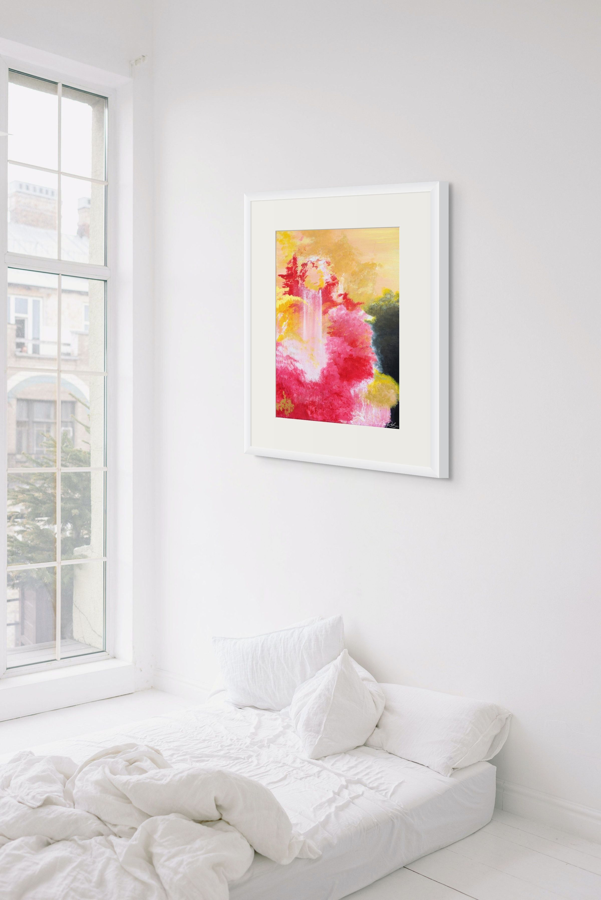
Joy of the Lord, 18×24 in framed paper print with 4-inch matte — shown in a bright minimal bedroom setting.
Pairing Ideas
- For a closely related blush-and-gold companion, pair this work with Pentecost, print.
- For another luminous work built around emergence and light, pair it with Third Day, print.
- For a quieter contemplative counterpart in the same warm palette, pair it with Advent 7, print.
- For a stronger red-and-gold note of victory and spiritual intensity, pair it with Jehovah Nissi, print.
Further Reading
Print Options & Materials
- Paper for a classic fine art presentation behind glass.
- Canvas for painterly depth and a softer wall presence that honors the painting’s origins.
- Metal for luminous, saturated color and a bold contemporary statement — especially strong at larger sizes.
- Acrylic for depth, clarity, and a polished modern finish that intensifies the color field.
Bathroom Suitability
For humid bathrooms and spa-style spaces, Metal or Acrylic are the strongest choices. Framed paper works well in dry, ventilated bathrooms with glazing.
Available sizes, media, framing, and finishing options appear in the product dropdown above; for more help choosing medium, framing, finishing, size, or placement, visit my Sizing & Placement Advice page.
Sizing Guidance
- Available sizes (live dropdown confirmed): 9×12 in, 18×24 in, 24×32 in, 30×40 in, 36×48 in.
- 9×12 in: intimate scale for a bedside, desk, or small prayer corner.
- 18×24 in: the color relationships open up clearly without losing intimacy.
- 24×32 in: a confident mid-range size; works well above a console, in a hallway, or as a bedroom focal point.
- 30×40 in: statement scale; the vertical light and upward movement take strong presence on a wall.
- 36×48 in: architectural presence; suited to tall walls, stairwells, open-plan living spaces, and rooms where the painting needs to anchor a large field.
- For more help with size and placement, visit the Sizing & Placement Advice page.
Quality & Care
Anne Reid Artist prints are produced for clarity, color, and everyday enjoyment. Handle paper prints with clean hands and frame them behind glazing where appropriate. Canvas, metal, and acrylic should be dusted gently with a soft cloth and displayed away from prolonged moisture or harsh treatment.
Shipping & Fulfillment
Orders are produced to order and shipped by my professional print lab partner in the United States. Production and transit times vary by size and finish; tracking is provided when your artwork ships. International orders may be subject to local duties, taxes, or import fees at delivery.
Integrity Notes
This is an open-edition print based on the 2016 original painting Joy of the Lord, acrylic on canvas, 20×16 in. The 2026 print edition preserves the core composition faithfully: the warm gold field, the pale vertical central passage, the rose and crimson massing, and the dark right-side form are all retained. The visible differences between the original and the print reflect normal reproduction cleanup and color calibration for print presentation rather than a new compositional state or variant.
Copyright & Credits
© 2016, 2026 Anne Reid Artist. All rights reserved. Original painting: Joy of the Lord, 2016, acrylic on canvas, 20×16 in; private collection of the artist.
Notes from the Studio
The original of Joy of the Lord remains in my private collection. I painted it at Catch the Fire Toronto, during a season when a meaningful chapter had closed and I did not have many words. I simply began to paint from the place I was in.
Over time I have come to see it as a signature painting — not because I set out to make one, but because it carries my testimony in color. It marks the place where grief began to open into healing, where a difficult transition became the beginning of a new creative language, and where God began to form a deeper, more sustaining joy in me.
The joy of the Lord is not shallow happiness. It is strength. It is presence. It is the deep work of God in the heart, making the inner life whole.
Need sizing or placement advice? Visit my Sizing & Placement Advice page or contact me: info@annereidartist.com