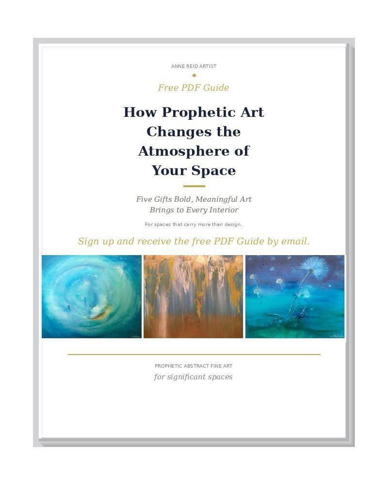
Summary
Community is an open edition fine art print by Anne Reid Artist, born from a fasting retreat at the National House of Prayer in Ottawa and the First Nations conviction that no one is left behind. Warm gold, amber, and ember-orange tones gather around an exchange of hands — an act of giving and receiving that distills the heart of Isaiah 58 into a single image. The 2021 print state deepens the edges and brightens the center, making this one of the most luminous and relationally resonant works in the collection. Available on paper, canvas, metal, and acrylic in four landscape sizes.
Artwork Statement
I painted Community in 2007 during a fasting retreat at the National House of Prayer in Ottawa. I had gone with a small group from Catch the Fire Toronto, seeking to understand God's redemptive plan for the creative arts. I was hungry — literally. Each day we passed a homeless shelter. At one gallery, a First Nations installation stopped me: it showed how an entire community shared everything they had. No one was left behind. That became the question I had to answer for myself.
One morning I sat down on the sidewalk beside a woman who had nothing. I had nothing to say and nothing of worth to offer — only the green smoothies I had packed as my food for the trip. I gave them to her anyway, as a sign to God that I had heard his voice. That afternoon, I painted Community. The hands in this painting are my hands. It is the heart of true religion — not performance or religious activity, but the simple, weighty act of sharing what you carry with the person beside you.
When I revisited the image for the 2021 print edition, I warmed the palette and strengthened the center so that act of giving and receiving would read with greater clarity and warmth.
Variation & Edition Notes
The 2021 released print state is a digitally reworked image state of the 2007 original watercolor on paper. The full composition is preserved unchanged. Adjustments are limited to warmer color, a darkened edge vignette, a brighter central spotlight, and revised contrast and values. No crop, composite construction, digital repainting, or background replacement was introduced.
Color & Mood
- Glowing amber, gold, and ember-orange — warmth that reads like welcome
- Soft whites and pale neutrals creating gentle, reverent light at the center
- Vignetted edges pulling focus inward, like a gathered circle
- Overall mood: comfort, togetherness, quiet strength, and compassionate presence
Design Notes
- Central glow creates a natural focal point at the heart of the composition
- Hands and offering suggest communion without literal narration
- Rounded movement keeps the eye circulating gently through the image
- Landscape 4:3 format gives the piece a grounded, stable presence on the wall
Where It Works
- Dining areas and gathering spaces — where shared meals and conversation happen
- Living rooms and sitting areas — warmth without visual noise
- Reception areas, counseling rooms, and nonprofit offices — welcome, care, and shared purpose
- Church lobbies, prayer rooms, and ministry offices — fellowship and belonging
- Hallways and transition spaces — a quiet reminder of connection
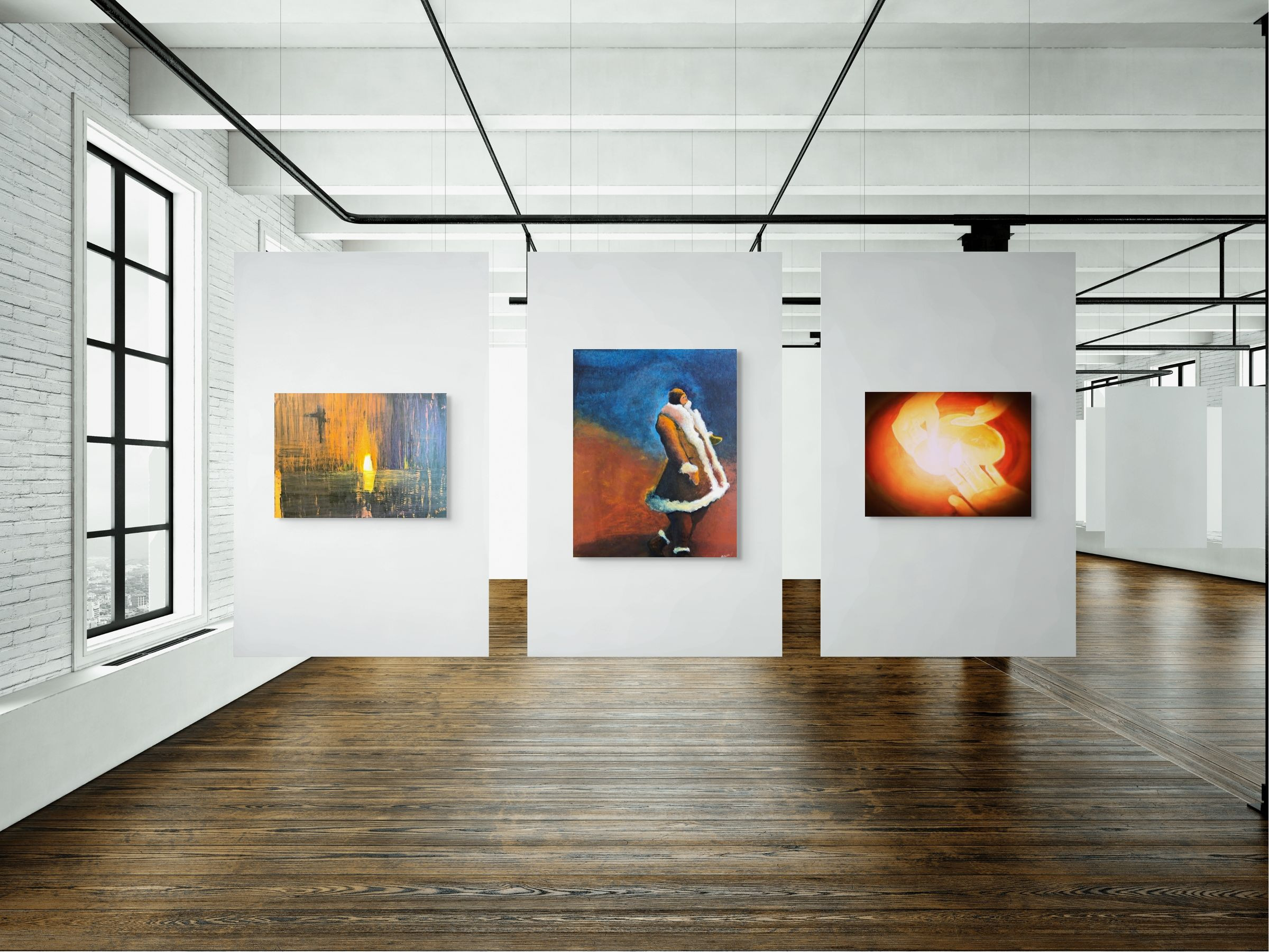
Community, fine art print — shown in a curated gallery-style wall arrangement with companion works.
Pairing Ideas
- Pair with Counsel 3, print — grounded wisdom and stability alongside communal warmth.
- Pair with Presence, print — calm assurance and nearness; the one who draws near.
- Pair with She's So Fine, print — warmth and humanity with a complementary glow; dignity met with belonging.
Further Reading
Related Viewing
Print Options & Materials
- Fine art paper print — archival matte surface; frame under glazing recommended
- Canvas print — gallery-wrapped depth
- Metal print — emphasizes the glow and warmth of this image; suits contemporary interiors especially well
- Acrylic print — luminous face-mount clarity that deepens the amber center
Bathroom Suitability
For humid environments such as bathrooms or spa-like spaces, Metal or Acrylic prints are recommended for durability and moisture resistance. Fine art paper works well in dry, well-ventilated spaces under glazing.
Available sizes, media, framing, finishing, and greeting-card options appear in the product dropdown menu above; for more help choosing medium, framing, finishing, size, or placement, visit my Sizing & Placement Advice page.
Sizing Guidance
- 12 × 9 in — intimate scale for shelves, nooks, or gallery walls
- 24 × 18 in — ideal for bedrooms, offices, dining spaces, and medium wall areas
- 32 × 24 in — strong visual presence over consoles, sideboards, or dining tables
- 40 × 30 in — statement size for primary living spaces, reception areas, or hospitality settings
For help choosing the right size or planning wall placement, visit my Sizing & Placement Advice page.
Quality & Care
Printed using professional fine art processes with color management to preserve the warmth and tonal depth of the original. Archival inks and substrates throughout. Avoid prolonged direct sunlight for optimal longevity; dust gently with a clean, dry microfiber cloth. For Metal or Acrylic, wipe lightly — no abrasive cleaners.
Shipping & Fulfillment
Orders are produced to order and shipped by my professional print lab partner in the United States. Production and transit times vary by size and finish; tracking is provided when your artwork ships. International orders may be subject to local duties, taxes, or import fees at delivery.
Integrity Notes
This released print state dates to 2021 and is a digitally reworked image state of the 2007 original watercolor on paper. The full composition remains unchanged. Adjustments are limited to warmer color, a darkened edge vignette, a brighter central spotlight, and revised contrast and values. No crop, composite construction, digital repainting, or background replacement was introduced. No artificial intelligence was used in the creation or preparation of this artwork.
Copyright & Credits
© 2007, 2021 Anne Reid Artist. All rights reserved. Community, original watercolor on paper, 2007, 10 × 8 in; print edition released 2021. Reproduction or use without written permission is prohibited.
Notes from the Studio
This print was donated to Kids Against Hunger Canada in memory of MaryLynn Caradonna, sister of Tanya, co-founder of Kids Against Hunger Canada. It is one of the works I am most grateful to have made — not because of the painting, but because of what it represents: that giving what you have, however small, is enough.
Need sizing or placement advice? Visit my Sizing & Placement Advice page or contact me: info@annereidartist.com