Exploring the Emotional Power of Heat-Toned Art in Designed Spaces
Mar 20, 2026
Exploring the Emotional Power of Heat-Toned Art
By Anne Reid Artist
About the author: Anne Reid Artist is a contemporary abstract painter whose work explores prophetic art, presence, healing, and the spiritual life of the studio through color, movement, and form.
Heat-toned art changes the emotional register of a room. Crimson, sienna, ochre, gold, rust, and ember tones do more than add color — they bring warmth, focus, movement, and conviction. In designed spaces, these hues can anchor a room, soften cool minimalism, and introduce a sense of human presence without visual clutter.
In my work, heat is not a trend effect. It is often prophetic language — fire as calling, covenant, refinement, glory, and presence. This article explains why fire tones matter in interiors, how they function in my artwork, and how designers, collectors, and hospitality professionals can use them with restraint and strength.
What do fire tones do in a designed space?
Fire tones — crimson, sienna, ochre, gold, rust, ember — are not passive neutrals. They carry direction. They set pace. They place emphasis. In a designed space, heat is not chaos; it is concentration. These hues ground a room in warmth, anchor movement, and guide the eye with conviction. Used thoughtfully, they bring balance: rooted yet alive, elegant yet expressive.
How do different heat tones tend to feel?
- Red stimulates and commands. It asks for engagement.
- Orange invites warmth, creativity, and joy.
- Copper and rust bring aged richness, echoing nature and endurance.
- Golden tones evoke radiance, reassurance, and lifted atmosphere.
Why are heat tones returning so strongly in interior design?
When culture swings toward speed, screens, and distance, interiors often answer with warmth — materials that feel human, palettes that restore presence, and rooms that hold the body instead of only displaying taste. The return of fire tones is not merely seasonal. It is corrective. It is a design language responding to fatigue.
What design shifts are helping fire tones feel current?
- Layered warmth is replacing cool minimalism: rich textures, quieter luxury, and palettes that feel lived-in rather than sterile.
- Earth-metal companions — brushed brass, camel leather, clay, limestone — pair naturally with ember undertones to create depth without noise.
- Brown-to-terracotta corridors continue to dominate residential and hospitality design because they calm the nervous system as much as they photograph well.
My work meets this moment, yet it is not built on forecasts. The heat in these paintings is not merely trend warmth. It is testimony: flame held as symbol, structure, and spiritual register.
How does heat manifest in Anne Reid Artist's prophetic art?
In my visual language, flame is a recurring symbol — of purification, calling, covenant, and glory. It speaks to both the seen and unseen. Sometimes it arrives as blaze. Sometimes as ember. Often, as presence.
Seed of the Woman
Radiant orange and blushing pinks collide in a vertical rain of light. The palette holds both Genesis promise and Revelation confrontation. Built for statement walls and rooms that can carry bold spiritual undertones without explanation.
Burning Bush
A lone tree bursts into golden flame yet remains untouched. A meditation on holy ground: vibrant firelight held in contemplative stillness. It anchors prayer spaces, sacred interiors, and rooms designed to invite encounter.
Glory Storm 4
The tempest and the torch — fiery motion that reads like wind in color. This piece brings energy to calm, neutral environments, giving designers a way to animate a space without adding visual clutter.
Rahab 11 | Rahab 12 | Rahab 13
Bathed in sunset gold and blazing orange, the Rahab works suggest protection and covenant covering. Shadowed windows hint at secrecy and salvation; figures stand gathered, anonymous, upheld. Heat here is not spectacle. It is safeguarding presence.
One of the Rahab originals now resides in a private collection owned by a Christian entrepreneur whose work shapes environments of hospitality. It was her first Anne Reid Artist painting, and the resonance of that work led directly to a commissioned piece that followed. That is a placement signal worth noting: not momentary admiration, but sustained conviction.
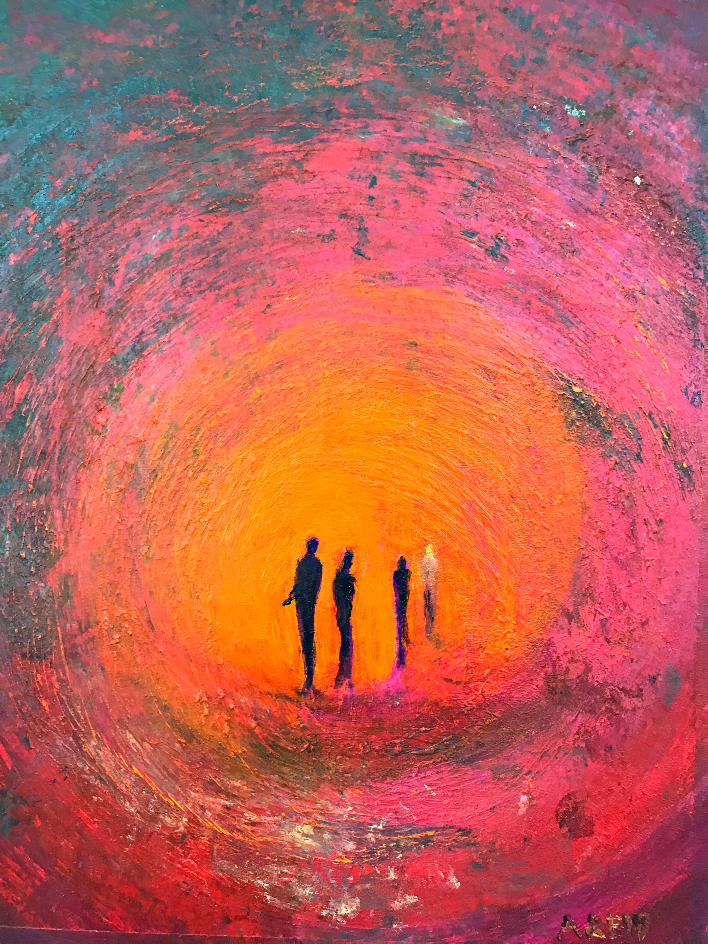
Fourth Man
Encircled by an inferno of pink, red, and orange, four shadowed figures stand within a furnace. One shines with otherworldly light. This piece holds deliverance without sentimentality — strong for chapels, libraries, and rooms intended to fortify courage.
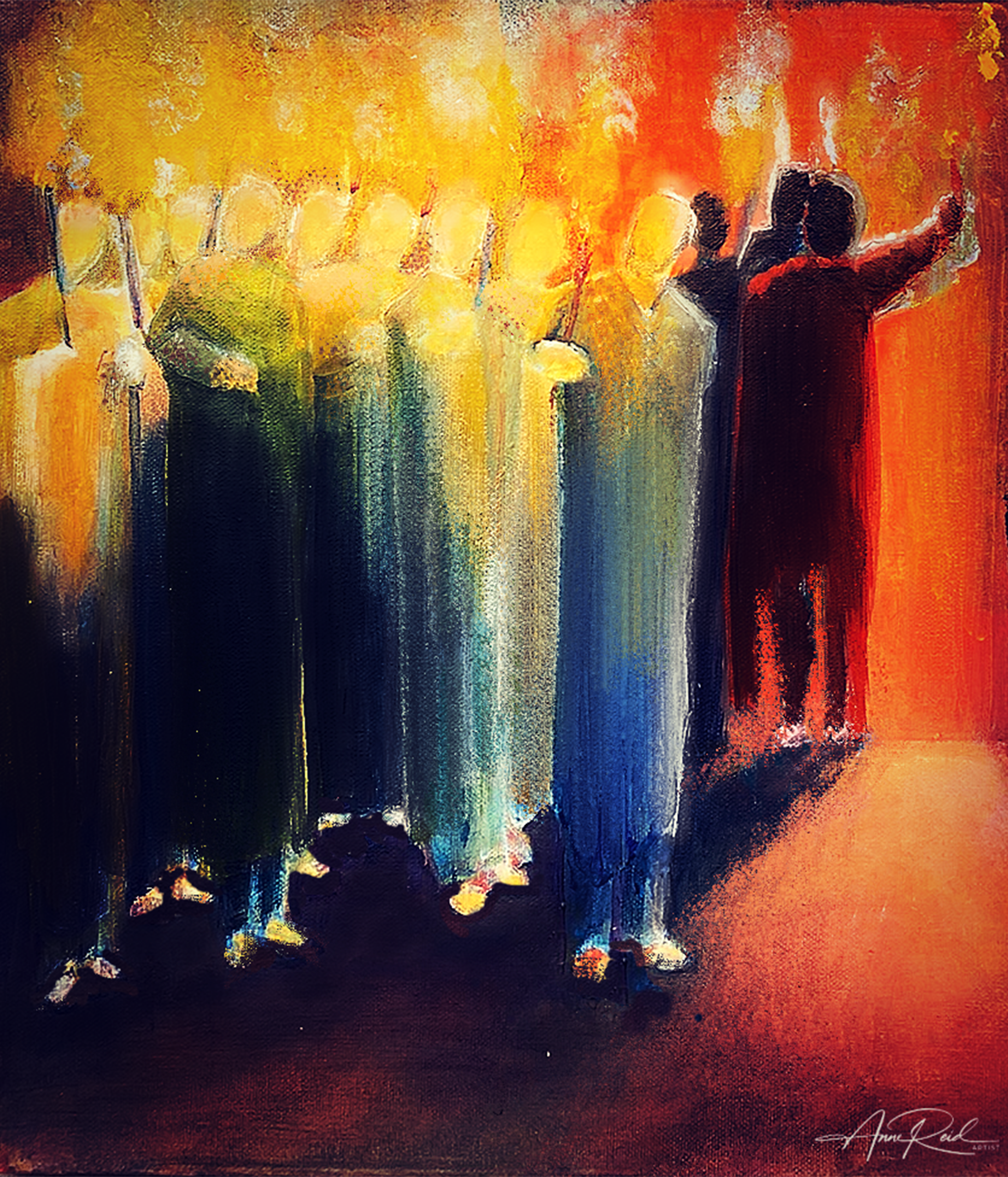
Presence
Vertical veils of color descend like rain, pierced by a column of golden flame. A cross emerges — subtle yet sure. This piece is about abiding: God revealed in stillness and glory. It suits counseling rooms, prayer spaces, and interiors designed for peace.
Some works offer a gentler burn — embers, not blaze. Hints of ochre and sienna speak of harvest, loyalty, and covenant. These are especially beautiful in dining rooms, libraries, and hospitality suites seeking warmth without excess.
What do these fire-toned works tend to carry?
- Calling and consecration
- Refinement and courage
- Warmth without sentimentality
- Presence, radiance, and conviction
How do you design with heat-toned art well?
When placed with care, heat does not overwhelm a room. It clarifies it.
1. Use it as an anchor
Let one piece establish emotional temperature before you finalize furniture. Fire tones excel at giving a room a center of gravity.
2. Balance heat with restraint
Pair flame hues with honest materials — linen, oak, stone, plaster. Let the painting carry intensity while the room carries calm.
3. Treat lighting as part of the composition
Warm palettes change through the day. Place the work where golden-hour light can move across it, or use a soft gallery spot to hold the glow after sunset.
4. Use contrast, not clutter
Fire reads best against quiet surfaces: matte walls, plaster, velvet, and natural wood. Let texture do the supporting work so the art can remain the voice.
5. Think beyond seasons
Fire tones are timeless. They glow in summer, smolder in autumn, and hold winter's edge. The longer a collector lives with heat, the more it becomes a language, not a phase.
Who does heat-toned art serve especially well?
Interior Designers: If you need a palette anchor, fire-toned art establishes the emotional register of a room before a single chair is chosen.
Collectors & Homeowners: If your space feels cold, too quiet, or undefined, start with heat. One piece can recalibrate an entire room.
Hospitality Professionals: Lobbies, corridors, boutique rooms, and gathering spaces thrive on memory. Fire-colored work creates warmth, resonance, and emotional recall — an invitation to return.
Heat is not chaos — it is concentration
In the visual language of interiors, fire hues bring depth, dignity, and declaration. Trend warmth uses earth and ember tones to make a room feel current and grounded. Meaningful heat goes deeper. In my work, red, orange, rust, gold, and ember are covenant tones: markers of passage, calling, refinement, glory, and promise. They do not simply style a room. They inhabit it with witness.
Designers: if a space feels too cool, too flat, or too distant, invite heat with intention. Let the color speak. Let it warm the room. Let it speak of more.
To understand more about the spiritual register behind this work, read What Is Prophetic Art? To explore fire-toned works directly, begin with Fourth Man or Burning Bush. For placement advice or commission enquiries, visit the contact page.
Frequently asked questions
Do fire tones make a room feel overwhelming?
Not when they are used with restraint. One well-placed heat-toned work can anchor a room without making it feel loud or crowded.
Are fire tones only for autumn interiors?
No. Fire tones are timeless. They respond differently across the year, but they do not depend on one season to feel relevant.
What kinds of rooms work well with heat-toned art?
Living rooms, hospitality spaces, libraries, prayer rooms, boutique interiors, studies, and any room that needs warmth, conviction, or emotional definition can benefit from heat-toned art.
What makes Anne Reid Artist's heat-toned work different?
In this body of work, heat is not merely aesthetic. It carries symbolic and spiritual meaning tied to calling, covenant, refinement, glory, and presence.