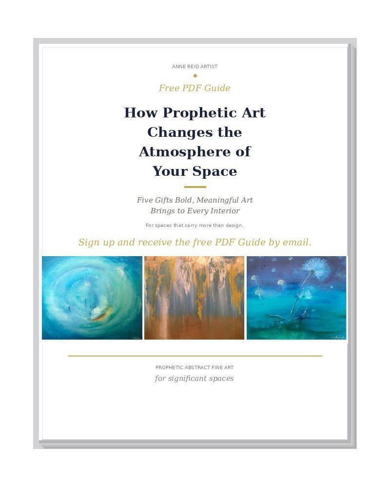
Summary
Pear, print is an open-edition fine art print by Anne Reid Artist — a single pear painted in bold, expressive color against a field of deep crimson, warm gold, and luminous orange. The composition is simple in subject and rich in atmosphere: still life reinterpreted through pure color and painterly energy.
Artwork Statement
This began as a painting exercise — an exploration of color, light, and mark-making using a pear as the subject. What emerged was something I didn't want to leave behind. The reds are what stayed with me: deep, warming, and alive. The teal and gold in the pear hold the eye and give the warmth somewhere to land.
I painted this on paper, mounted it on panel board, and it sold at an art show in Toronto. I loved the colors too much not to make a print.
Color & Mood
- Deep crimson and plum — rich, warming, grounding
- Luminous gold and orange upper-right field — light source and warmth
- Teal-green and cobalt blue pear body — cool contrast that holds the composition
- Golden yellow lower pear and base — abundance, fruit, warmth
- Overall mood: bold, warm, energetic, alive
Design Notes
- Square 1:1 format — balanced, versatile, strong in both solo and grouped arrangements
- Single subject composition — immediate read across the room; holds its own at any size
- High-contrast palette — the crimson field and teal-green pear create strong visual energy
- Warm dominant palette suits kitchens, dining rooms, and social spaces
Where It Works
- Kitchens and dining rooms — the classic still-life territory; the bold palette energizes food and gathering spaces
- Living rooms and hallways where a single strong color statement is welcome
- Offices and studios that suit warmth and creative energy
- Gallery walls as a bold warm anchor among cooler works
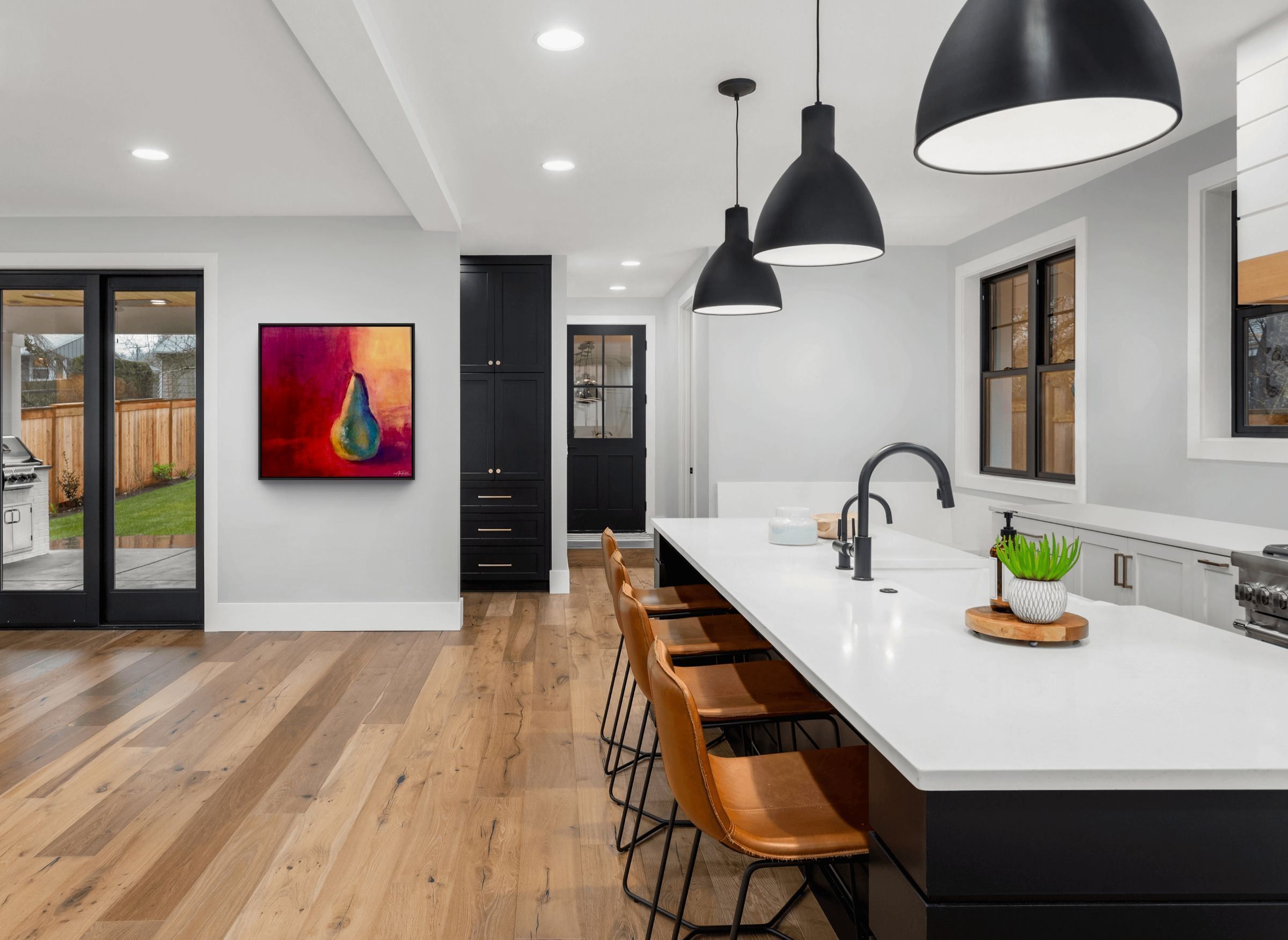
Pear, 36×36 in canvas print — shown in a kitchen setting.
Pairing Ideas
- The Apple, print — natural still-life companion; fruit, warmth, and bold color in the same expressive register
- Altar 7, print — warm orange field and circular energy; a contemplative counterpoint to the pear's directness
Further Reading
Print Options & Materials
- Paper for a classic fine art presentation behind glass
- Canvas for painterly depth and warmth — especially suited to kitchen and dining settings
- Metal for saturated, vivid color and a bold contemporary finish
- Acrylic for crisp depth and a polished, high-gloss look that intensifies the crimson and gold
Bathroom Suitability
Yes — Metal or Acrylic prints are recommended for humid environments. Framed paper prints are suitable for dry, well-ventilated spaces with proper glazing.
Sizing Guidance
Square format (1:1 aspect ratio). Available sizes:
- 12×12 in — intimate scale; suited to a shelf, desktop, or small gallery-wall accent
- 16×16 in — confident small-room presence; works well in a kitchen nook or narrow hallway
- 20×20 in — mid-scale statement; strong above a counter, console, or side table
- 24×24 in — large-format presence; anchors a dining room wall or kitchen feature wall
- 30×30 in — statement art scale; commands a living room or open-plan space
- 36×36 in — architectural-presence scale; a bold single statement for a large wall
- 40×40 in — architectural-presence scale; suited to grand interiors, hospitality spaces, and feature walls
Visit my Sizing & Placement Advice page for wall-fit and hanging guidance.
Quality & Care
Printed with museum-grade inks on archival substrates for lasting color fidelity. Metal and acrylic prints: wipe clean with a soft microfiber cloth. Paper prints: frame with acid-free materials and UV-protective glazing to protect against light exposure over time.
Shipping & Fulfillment
Orders are produced to order and shipped by my professional print lab partner in the United States. Production and transit times vary by size and finish; tracking is provided when your artwork ships. International orders may be subject to local duties, taxes, or import fees at delivery.
Integrity Notes
This open edition print is prepared from the original 2018 painting Pear (acrylic on paper mounted on panel board, 12×12 in); the print edition was produced in 2025. The print state includes color enrichment introduced during print production preparation — the pear body reads with a stronger teal-blue-green and cobalt tone than the original warm-green. The underlying composition, form, and painterly character are faithfully preserved. No AI generation was used.
Copyright & Credits
© 2018, 2025 Anne Reid Artist. All rights reserved. Original painting Pear, 2018, acrylic on paper mounted on panel board, 12×12 in; private collection.
Notes from the Studio
This started as a painting exercise and became something I kept coming back to. The reds are the reason — they have a warmth that is hard to leave behind. The original sold at an art show in Toronto and I was glad to have made a print of it first.
Need sizing or placement advice? Visit my Sizing & Placement Advice page or contact me: info@annereidartist.com